
Mirror Mania Tips
Interior Designer Colour Trends to Watch Out For
01
Feb
Feb
Full article with thanks to: elledecor.com/design-decorate/trends/a38542286/color-trends-2022
In 2022, as we grapple with a world irrevocably shaped by the pandemic, our new habits, lifestyles, and general mental well-being will continue to influence how we choose to paint our homes. But where colour trends the past few years tended to lean into comfort and stability, the next few months will bring us a bolder, brighter palette, according to paint experts and trend forecasters. In a word, colour is back.
Andrea Magno, director of colour marketing and development at Benjamin Moore, has witnessed this trend first hand. “We see consumers looking for their homes to not only bring them comfort, but happiness,” she says. “Choosing the right paint colour is where that all begins. It is subjective, expressive, and has the power to completely transform a space.”
And as many of us continue to work from home, colour has also become a proxy for our personalities. “These rooms double as a video filming set, creative studio, workshop, warehouse,” says Gemma Riberti, head of interiors at the trend forecasting group WGSN. “The colours people surround themselves with becoming backdrops for personal branding.”
But what hues, in particular, will dominate the year ahead? We polled the pros to find out.
EASY BEING GREEN
Green has been trending for a couple of years now, and 2022 will see the hue continue to rule as we seek to feel closer to nature. “You can always count on a rich shade of green to evoke the calming, enveloping spirit of the great outdoors,” says Nicole Gibbons, founder of the direct-to-consumer paint company Clare. Gibbons cites Clare’s deep forest-green Current Mood as a customer favourite and Matcha Latte, a brighter emerald hue that is “perfect for energizing any space with a burst of colour that draws from natural greenery.”
“If you’re looking for the perfect balance of boldness and versatility, green is certainly for you,” she adds.
And then, of course, greens were ubiquitous in the annual colour of the year designations. Benjamin Moore named the sage-toned October Mist as the 2022 colour to watch: “It’s incredibly adaptable and versatile and creates a canvas for experimentation, encouraging the use of colour in the home,” Magno says. “Green sits between the warmer yellow colour family and cooler shades of blue on the colour wheel, making it easy to create combinations no matter what your personal style is.”
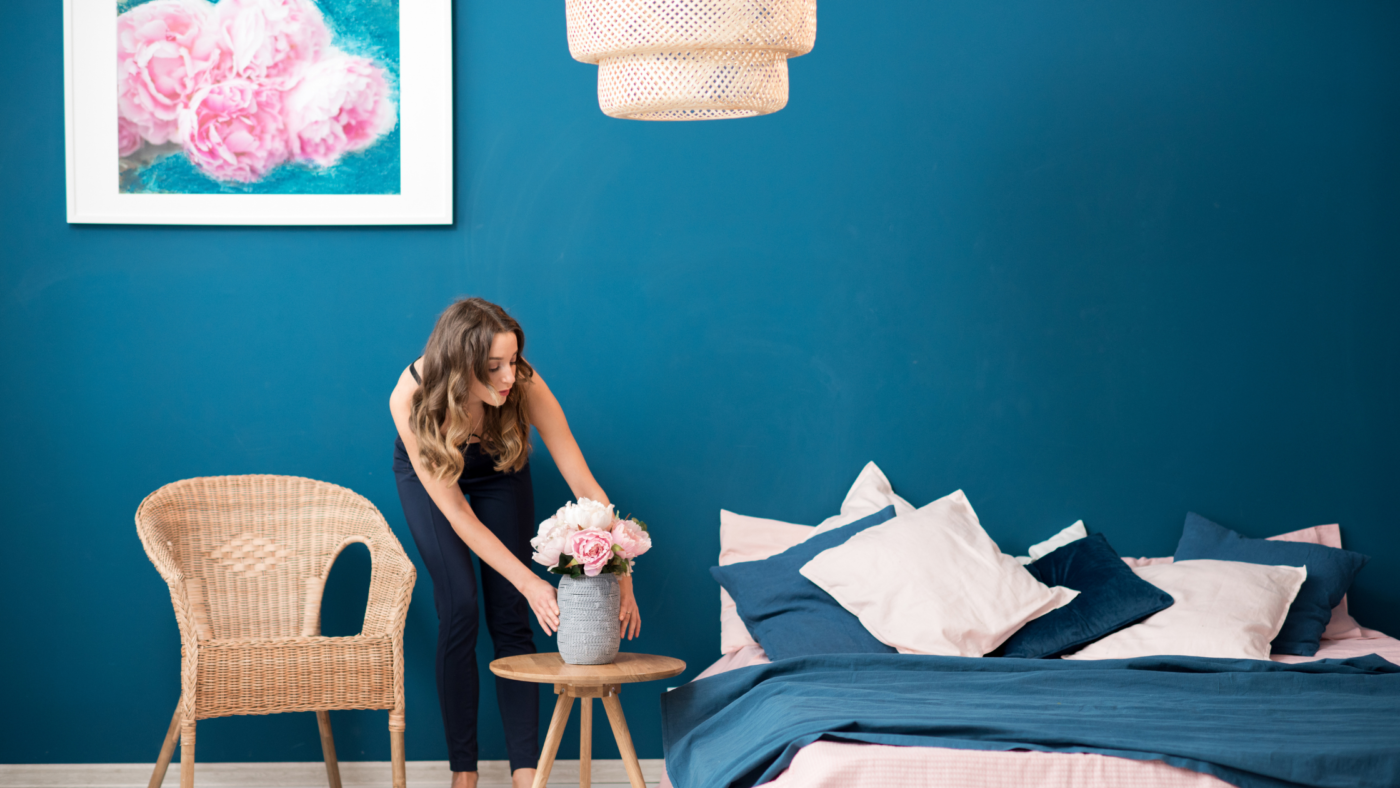
MOODY BLUES
“Shades of blue are going to be the go-to for dining rooms for those who want to stay away from neutral paint tones in this room,” Gibbons says. “A shade such as Goodnight Moon, a strong midnight blue hue, is dark and alluring and the perfect saturated tone for a dramatic dining area.”
Riberti, of WGSN, also sees 2022 bringing about a decidedly blue period, in particular, “a luminous mid tone blue, cool and warm at the same time as it evokes the lightness of clear skies,” she says. “It works well to complement the naturals or other mid tones with a reassuring simplicity yet positivity that resonates well with consumers.”
COMING UP VIOLET
Pantone’s recent unveiling of Very Peri as its 2022 colour of the year is indicative of a more generally welcoming attitude toward undertones of violet and purple—once pariahs of the interior colour world.
This is in line with WGSN and Coloro’s prediction for the dominance of Digital Lavender all the way through 2023, though the duo’s equally vibrant pick for 2022—Orchid Flower—falls on the more magenta end of the scale. The choice, WGSN and Coloro described in an announcement, was based on the saturated colour’s “sense of positivity and escapism [that] embodies the dopamine brights trend that has been peaking across industries as we navigate toward a post-COVID world.”
If you aren’t ready to be quite so bold with your colour choice, Magno says that Benjamin Moore’s Hint of Violet is a “playful and invigorating pale” that will enliven a space with “effortless whimsy and charm.”
NATURAL TERRITORY
Despite the popularity of bold colour statements, some people are still looking to imbue their spaces with as much calm and serenity as possible.
“Warm neutral paint colours are having a moment as well, and it’s not hard to see why,” says Gibbons. “Along with bringing warmth and versatility to a space, a neutral paint palette can instantly make a room feel cosy and comforting.” She recommends neutrals for your most-used spaces, such as hallways and living rooms, a move that will “work with a variety of decor styles while creating a more inviting ambience.” Among Gibbons’s favourite neutrals are Clare’s On Point, an off-white that can read warm or cool depending on your lighting conditions, and creamy Neutral Territory.
For a neutral with added warmth, Riberti predicts a proliferation of terrestrial tones. “New organic hues are growing increasingly nuanced, from natural earthy tones such as clay and plaster to richer pigments that tap into the warm tactility of terra-cotta.”
TEXTURED WHIMSY
It’s not just the colours themselves that are being used to inject personality. “Another statement we’re seeing is colour washing, a faux-finish painting technique that gives you a very soft, textured colour application—much like the transparent look of watercolours,” says Magno. “It harks back to the romance of the Old World and elegant interiors with sculptural plaster walls.”
Riberti agrees that textural washes and surfaces will also have a strong presence in the year ahead. “Achieving or enhancing tactility to create spaces that have a natural, lived-in, and comforting feel is definitely driving a lot of interior designs,” she says.
These observations tie into a broader trend: a return to the craft and time-honored methods. “This includes limewash and clay plasters, and the appreciation for traditional techniques such as tadelakt and adobe finishes,” Riberti notes. “Alongside this, brush, sponge, spatula, comb, or popcorn techniques—whether more abstract and rough or more rhythmical and controlled—all are being reexplored to deliver dimensionality to the space.”
Full article with thanks to: elledecor.com/design-decorate/trends/a38542286/color-trends-2022
Did you enjoy that? Why not share this article.
Looking for beautiful handcrafted mirrors or glass wall art? Explore our online shop for your next interior piece! If you’re looking for different colour and finishes, we offer customisation on most of our products before your purchase.
Learn more about our unique mirror and glass design.